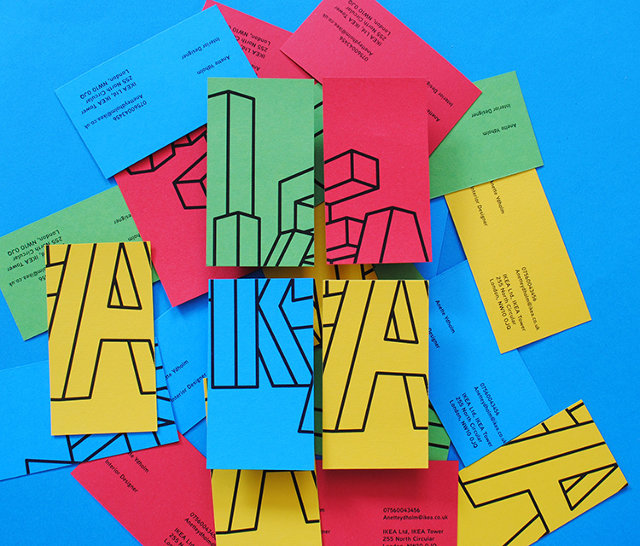
Ikea’s traditional blue and yellow logo was designed as a nod to the company’s Swedish heritage. It’s easy to recognize and can be seen from a distance, as you drive up to the warehouse-sized store. Other than that, the logo is pretty bland.
Ikea’s merchandise, however, has many characteristics: It’s minimalist, affordable, space-friendly, and has tongue-twisting Swedish product names. Its graphic identity just doesn’t really speak to any of them. “It’s instantly recognizable as being a Swedish institution, but does it suit Ikea as a company in 2014?” asks student designer Joe Ling. “I don’t think so.”
Find out more about brand identity ideas for Ikea here.